
Surprise!
I'm also interested in teaching and sharing my thoughts about UX, visual design, micro-interactions, and design in general.
I'm also interested in teaching and sharing my thoughts about UX, visual design, micro-interactions, and design in general.


Money app is specialized for children's saving account which provides learning and management features. Our vision is changing financial behavior for good by empowering kids to make meaningful financial decisions with the guidance and support of their families.
Nowadays, there are variety of tools and software out there for teens to learn almost anything. Oddly enough, with this almost unlimited access to knowledge, through our research, we discovered that there isn't really an appropriate way to learn financial behaviors. Most parents don't even know the proper way to teach their kids good financial habits. Our app, "Money," is designed to help fill that niche to support teaching good financial habits to teens (and tweens) along with their parents' support.
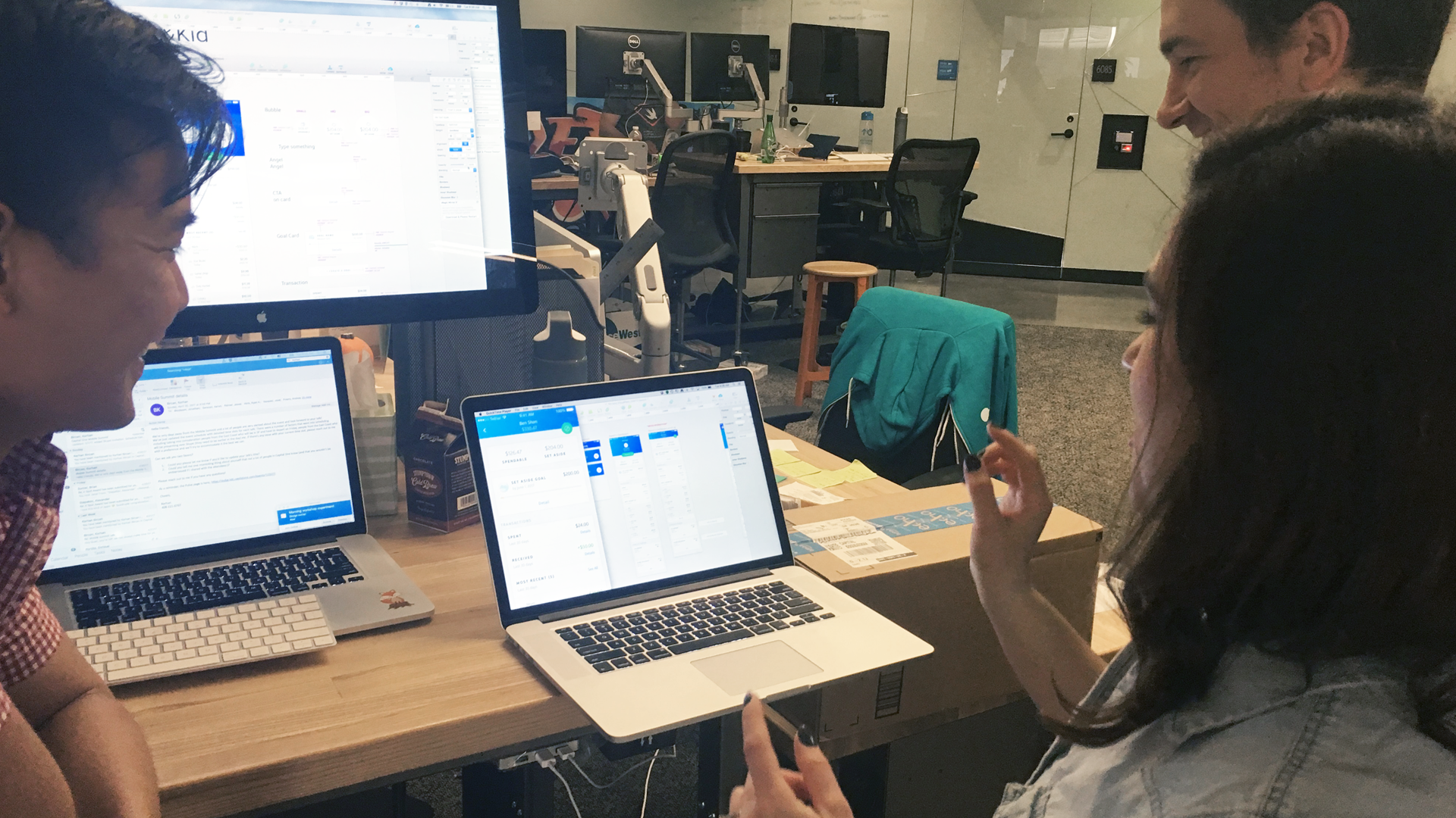
I worked with one other product designer, a UX researcher, a product owners and 10+ engineers (iOS, Android, and back-end). As with most product designer roles, I did a little bit of everything, but I led the visual and interaction and visual design portions of the product.
My responsibility was to come up with good features and experiences on the dashboard for both the parent's and child's home screen (this project was especially interesting because we had to design a different, but still cohesive, experience for both parents and teens). More specifically, my goal was to make the money transfer process and the at-a-glance financial view easy, intuitive, and - especially for the teens - delightful. There were several challenges when we started with this project.
- To become the financial hub for families where teens can develop and sustain good financial habits.
- Where teens learn to manage money by receiving, spending, borrowing and saving.
- Where parents are in the know, can support, and teach sustainable financial habits.
Bank accounts for kids are just that: bank accounts. No learning or management features. good financial habits.
None of the designers - or anyone else on the team (until the product owner changed towards the end) - had any kids. Understanding both parents' and kids' mental models for financial behavior is tough without having experienced them first hand.
We are trying to help teenagers manage and save money, but our product (at least in its first iteration) only allows for a checking account.
Money is stressful for everyone - even teens. The typical banking view is filled with a bunch of transactions with separate dollar amounts, so it's really hard for teens to get an accurate picture of their financial status at a glance. Unless they do mental calculations, they won't know how much they've spent and how much they've received from their parents.
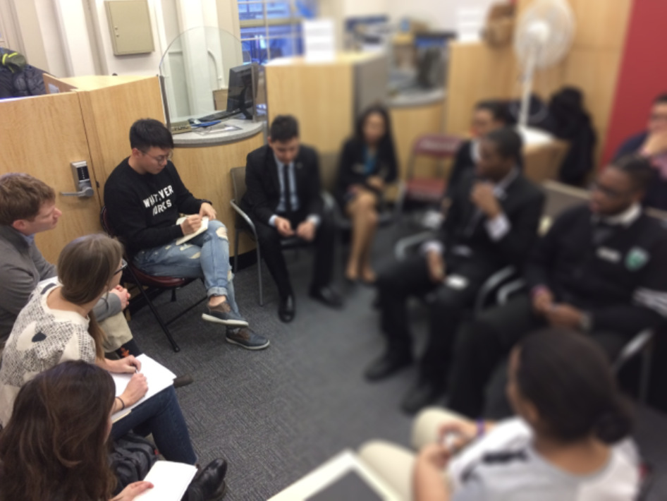
We conducted user interviews with teenagers and their parents to get a better understanding of their mental models of financial behavior. Without understanding their mental models and pain points, we couldn't possible know what kinds of features might be relevant to them. Furthermore, we have to efficiently support parents in their effort to help teach their kids good financial habits in our app or the product will never be successful.
20 parents / 32 kids
San Francisco & New York
First, get to understand how, why, and when parents and teens decide to save money. Second, understand how we can motivate teens to proactively save money. Third, figure out how to make the virtual bucket clear for the teens.
We learned that not only do parents give money to children, but parents also borrow money from their kids (like when they don't have cash on hand). Lucky for the kids, parents always pay them back for these exchanges, and some parents even pay it back with interest to take advantage of the teaching moment!
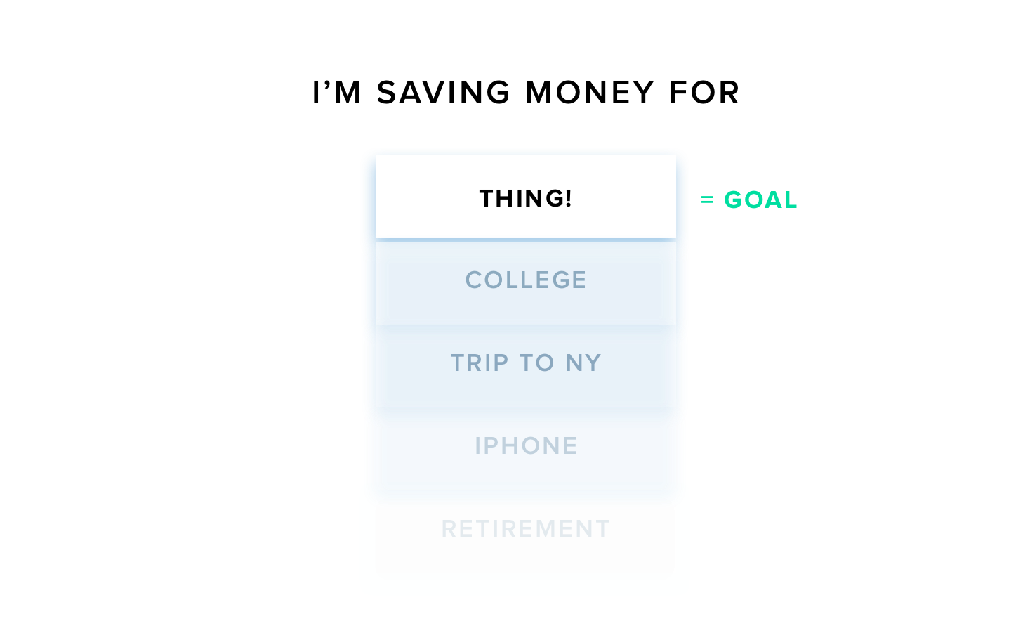
We found very interesting things from testing regarding teens' saving and spending habits. Our assumption was that they might save money for the 'future' (like college, a car, or even just for the purpose of saving with no particle future goal in mind). What we learned, however, is that teens are motivated to save when they want to buy a thing (guitar, sunglasses, video game, etc.) and it's almost always a short-term savings goal.
Setting up a goal can help kids save and better manage their money. Some parents give actually give an award to their children once they achieve their goal. Most "savers" are saving money because they know they'll earn something extra.
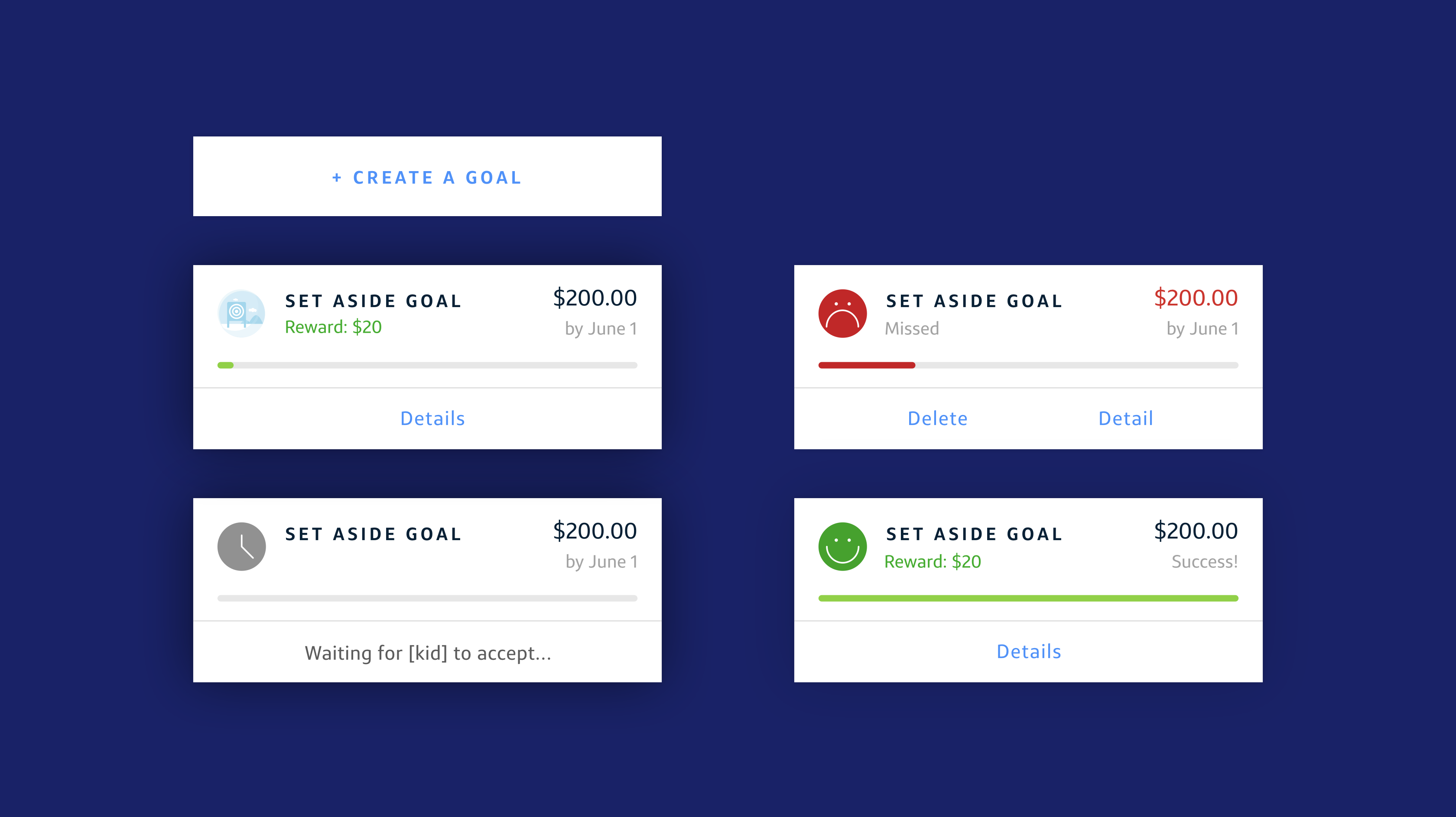
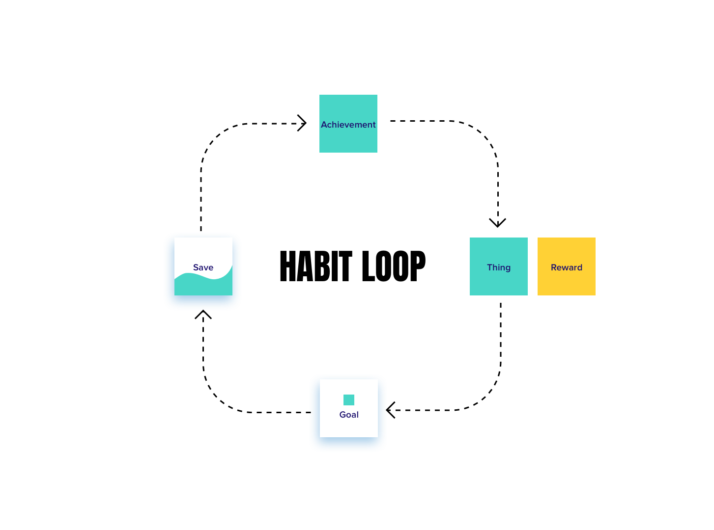
Based on their behavior, I wanted to create an ecosystem that would make kids continuously save money. So, for example, when they have a thing they want to buy, they start saving money because they have a goal. If they achieve their goal, they feel accomplished, but they'll also get a reward from their parents. This single-loop experience can create a savings habit which will make them save again and again.
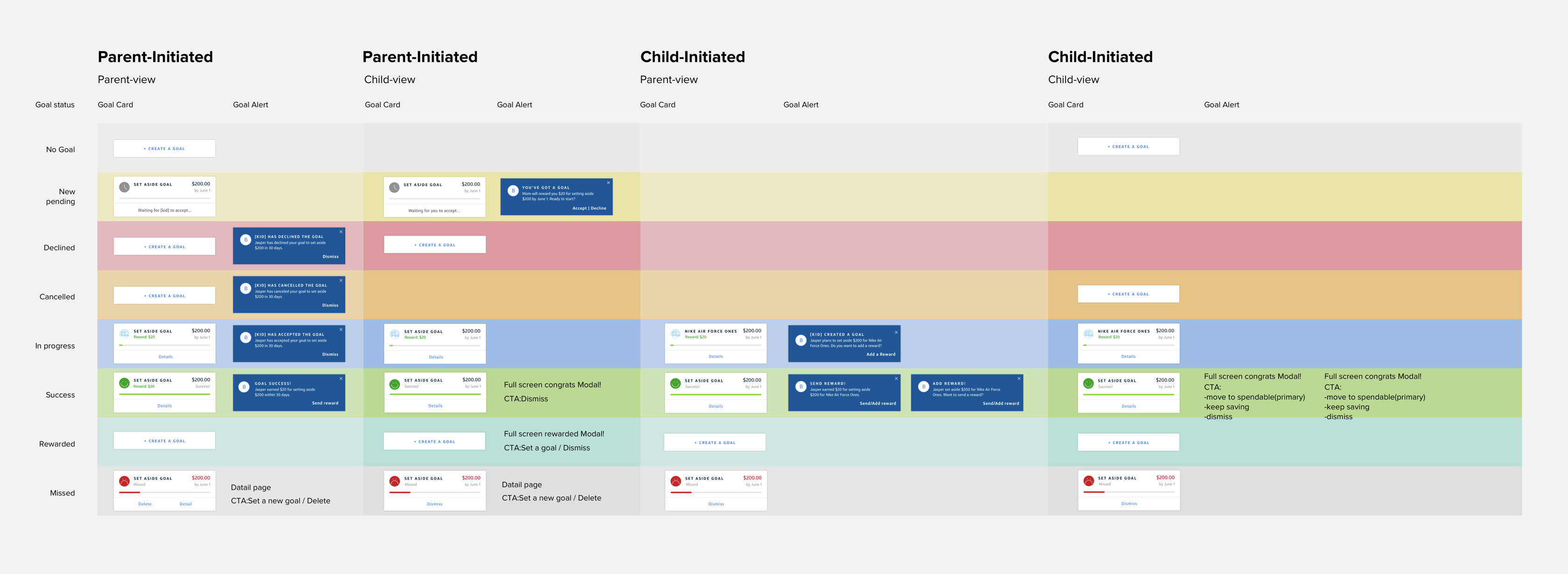
Both parents and children can initiate a goal and parents can set the reward once kids achieve their goal. To illustrate this, I made a system map of interactions between parents and kids along with goal.
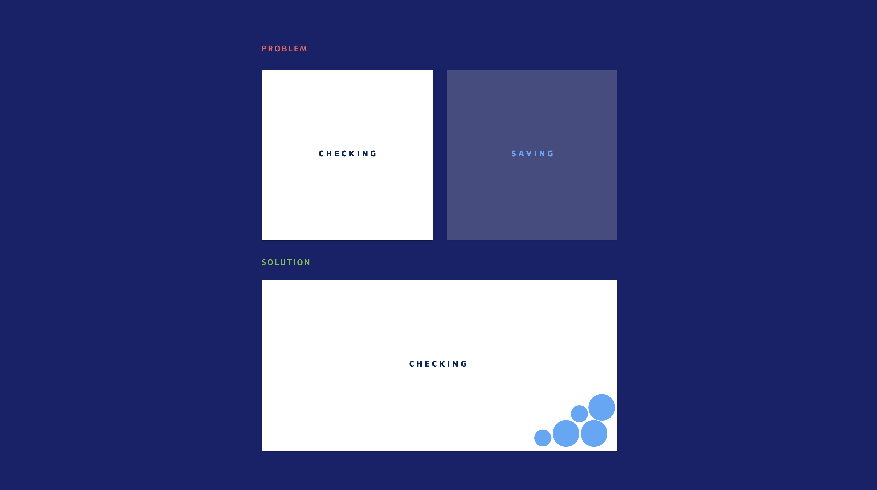
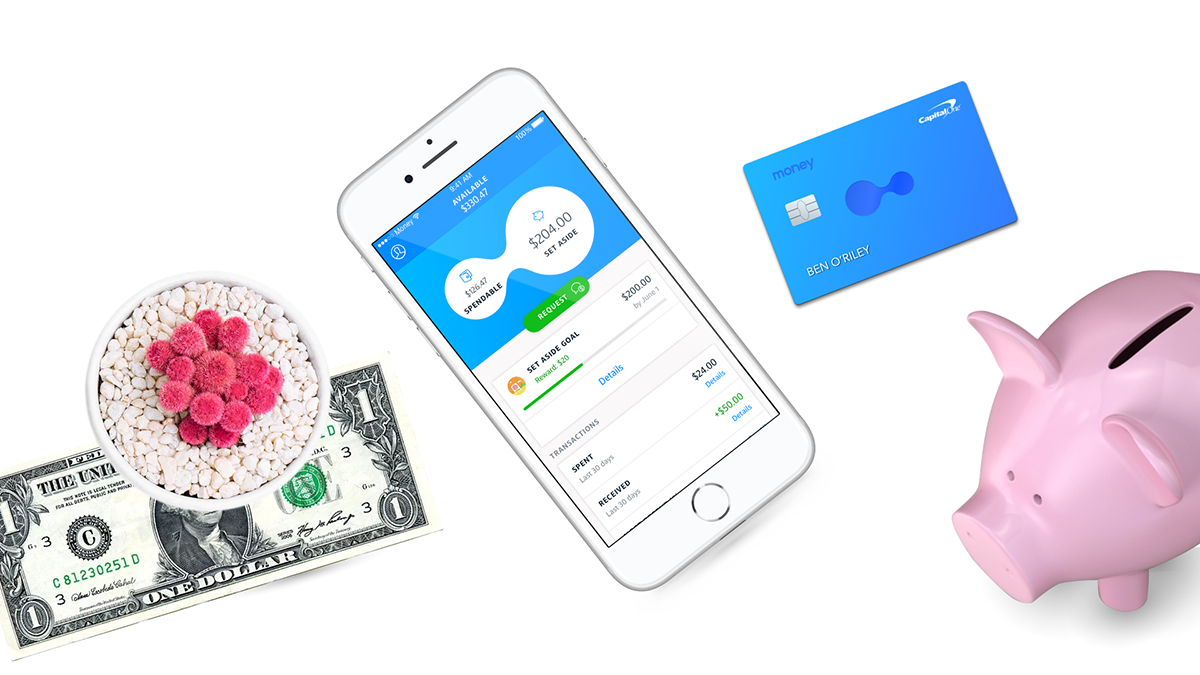
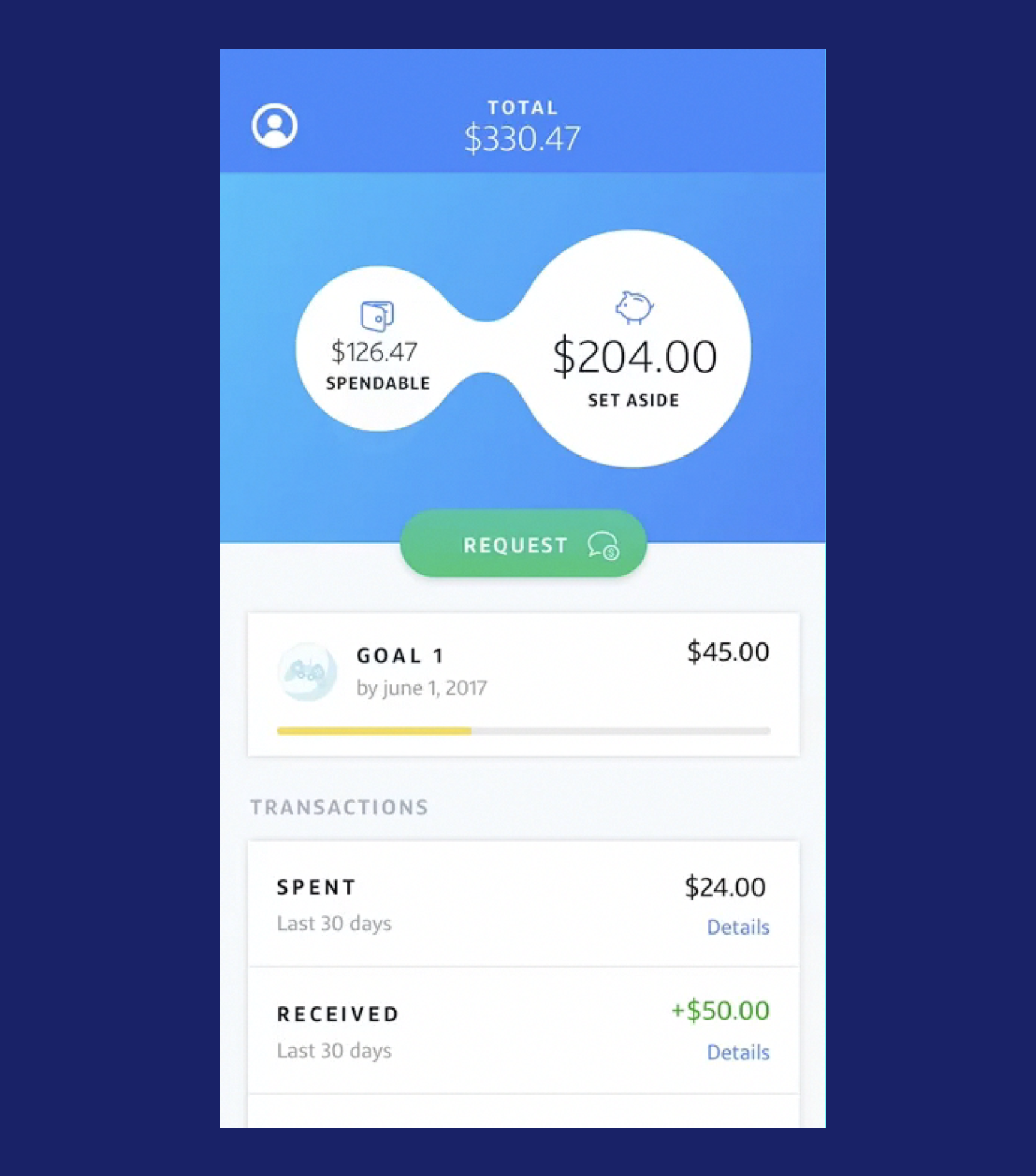
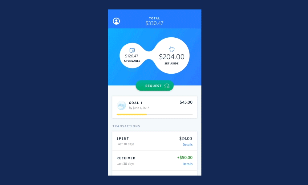
Our second big challenge was figuring out how to teach the kids good saving behavior without an actual savings account. Somehow we had to solve this and create the experience of saving within one checking account. Our solution was to hack the system with a 'virtual bucket,' effectively a separate 'bucket' which acted as a savings account. This meant that the teens could separate money into two groups within one account. To avoid confusion, we had to make it clear that they only had one account and we also knew that we had to come up with different names for the two groups besides "Checking" and "Savings". We ended up landing on "Spendable" and "Set Aside," which were terms that the teens themselves used during testing.
My design team faced the problem of translating our mental model to a conceptual model. We tested a few different virtual bucket concepts (including a pocket, a vertical cylinder, and stacks of cash).
Based on the teens' mental model, we made several conceptual models.

They tended to understand the horizontal concepts better than the vertical ones. They also understand how to save money, but they still thought they had two accounts. I revisited the task again and came up a new concept. I tried my best to find the right metaphor. Since a more organic flow was my personal mental model for money, I suggested a balloon or bubble idea, and everyone loved it. After trying out so many different concepts, it was truly a eureka moment!!
The bubble idea allowed the user to push money back and forth from one side (spendable) to another side (set aside). The testing results for this concept were extremely successful. Not only did our users intuitively understand the idea but they also mentioned the delightful nature of the bubble: "It's not like a banking app and I want to play with this."
We tested again with this concept and the teens understood the concept immediately. In fact, it worked so well that our testers actually tried to touch and slide the bubble: "Can I swipe on bubble to transfer money?" The bubble made so much sense to everyone, and was so delightful, that we ended up using it as our logo and identity.
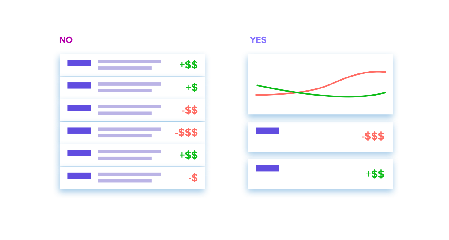
Tradition bank transactions are not fun to look at - there's a lot of text and numbers, which isn't always helpful information. Also, the parents are more interested in a bigger picture view of their kids' spending. They prefer seeing how much their kid has spent or received from them in the past 30 days. Sometimes they want to see details about where they've spent their money, so the ability to drill-down is obviously necessary, but the first thing they want to check is an aggregate view of their money flow.
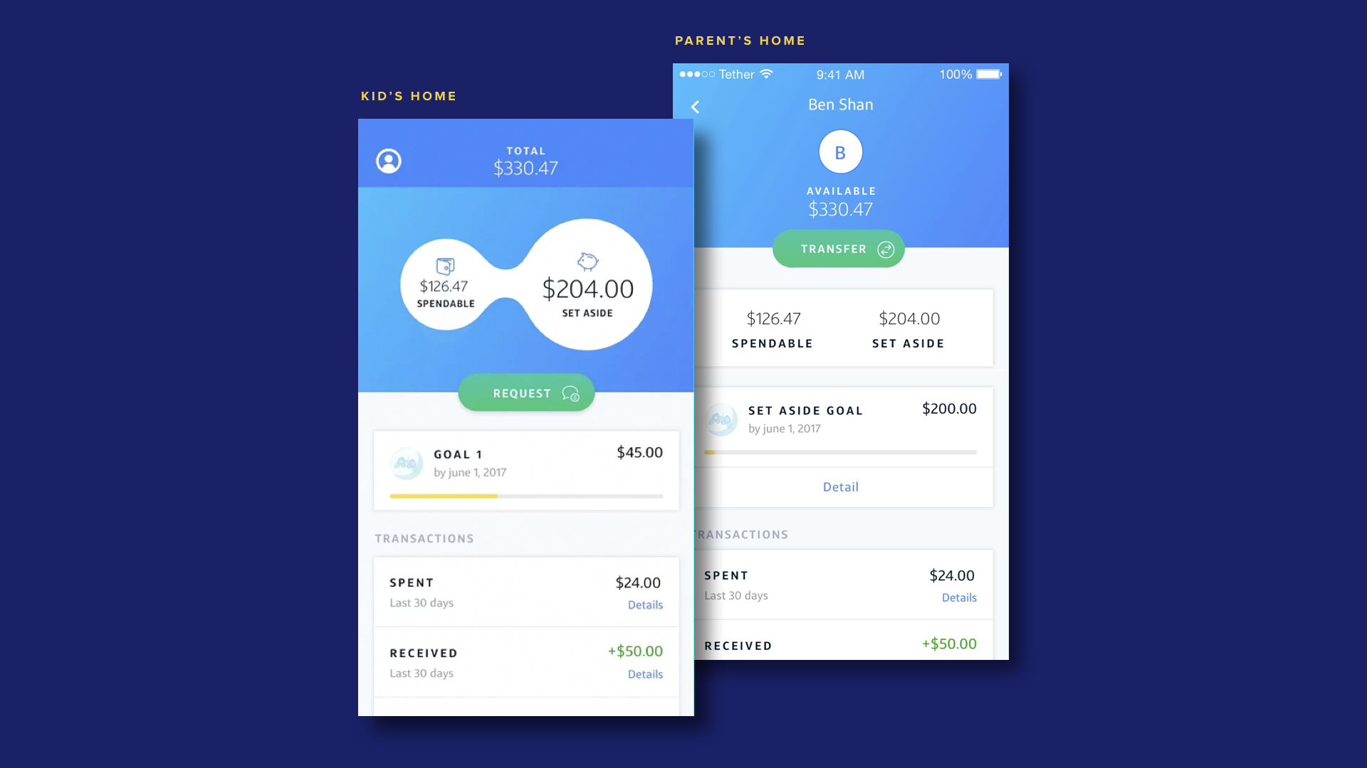
Using that logic, I tried to make the view as simple as possible to easily scan for both the parents and kids dashboard view. For the MVP, we are not going with the graph or chart but we are exploring the visual aids for a future version.
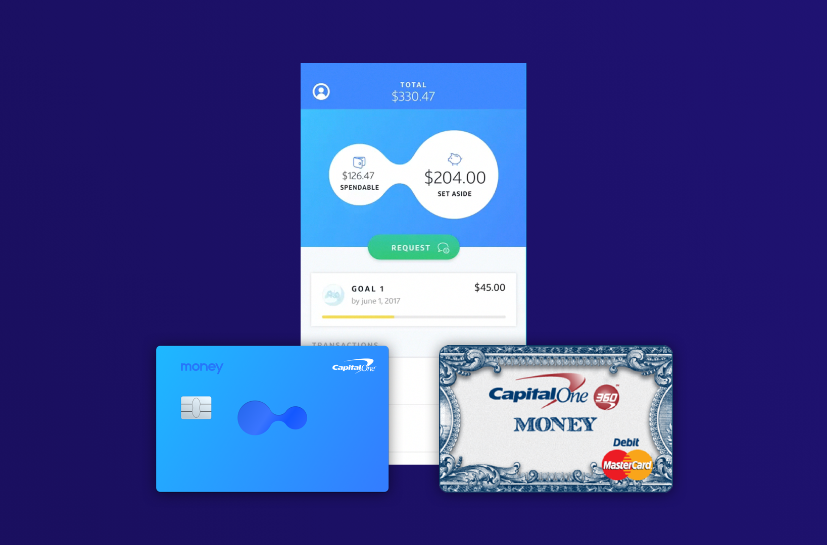
Teens share what they are excited about with their friends. How can we capture that excitement with a debit card and an app? It's got to be something really smooth and delightful!
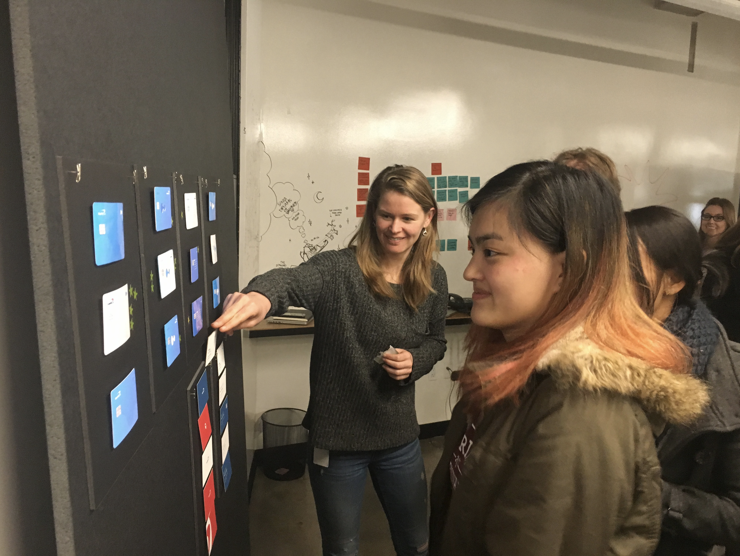
We had an existing physical debit card(Money account), but it had a different look and feel from the app. I proposed a new debit card to make the entire experience a cohesive one with both the digital (app) and physical (debit card) working together. I ran several workshops to narrow down the design to the top 3 and then ran A/B test with our users.
Micro-interactions have the power to make the user experience delightful and satisfying in a way that many design elements cannot. I believe a delightful experience is the key for this product, so I've spent some time pitching the idea inside and outside of team to make sure we care about it. As a result, everyone, including leadership, got onboard so we could apply the animations and illustration in our App.
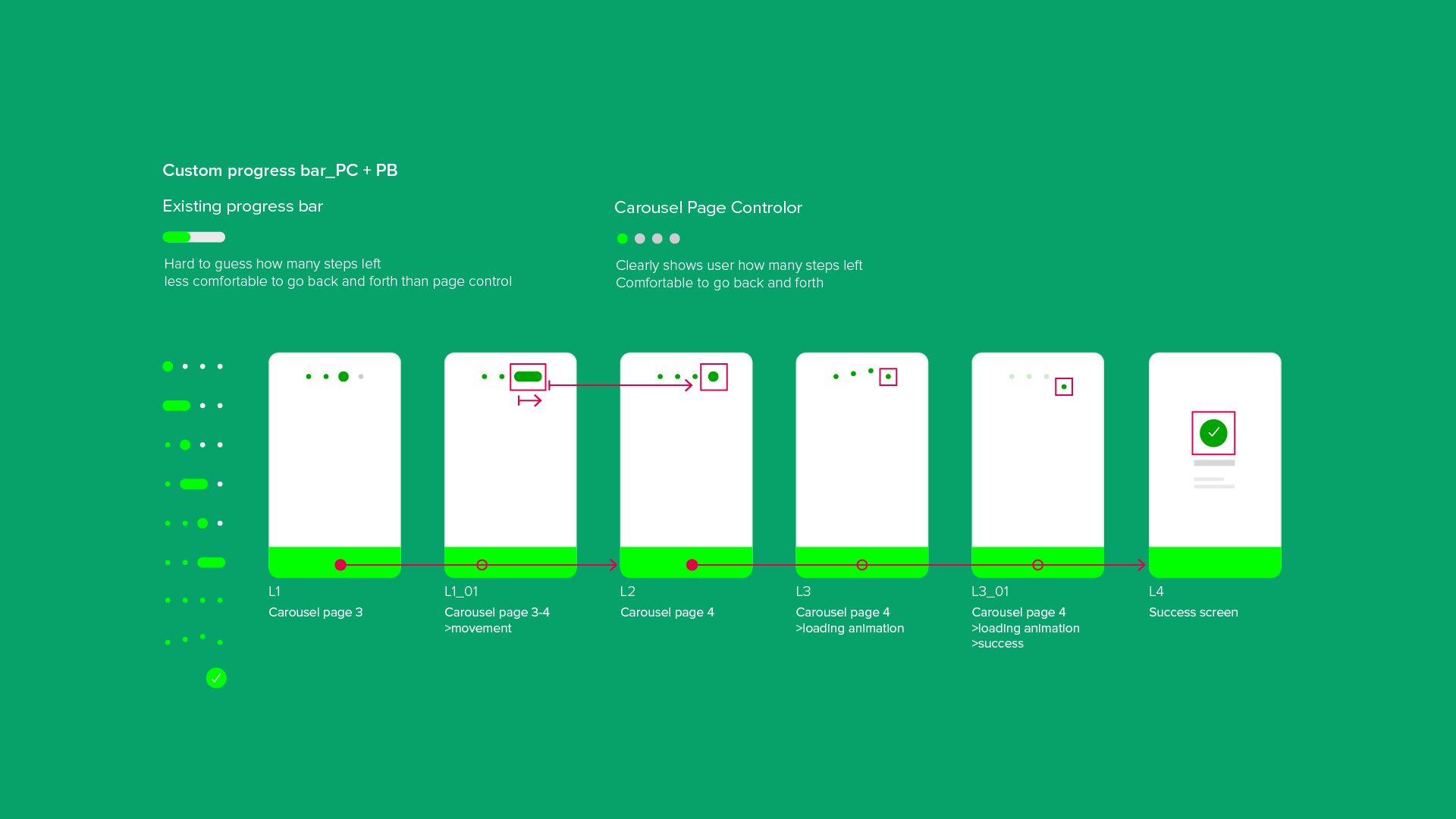
Usually users skip the onboarding pages, so I decided to add an interesting transition between the carousel screens to encourage the users, but especially the kids, to read the content.
Pulling down to refresh is pretty common, especially when your waiting on real-time financial transaction data. If there is a little detail, rather than the generic loading spinner, while they are waiting, it will hopefully add a bit of delight to their day.
Once the user dismisses all notifications, they will see this cute animation I created at the end.
Request or transfer money is main CTA for the user until they scroll down on the transaction view. If they scroll down on the dashboard, then their main action is looking the bottom section, so we scale down the top section to expand the transaction page.
We launched our open pilot within 1 year and this feat (both regarding smooth UX and speed of execution) has been highlighted countless times by senior leaders. Our pilot users, both parents and children, continually comment on the ease-of-use of the app internally.