
Surprise!
I'm also interested in teaching and sharing my thoughts about UX, visual design, micro-interactions, and design in general.
I'm also interested in teaching and sharing my thoughts about UX, visual design, micro-interactions, and design in general.


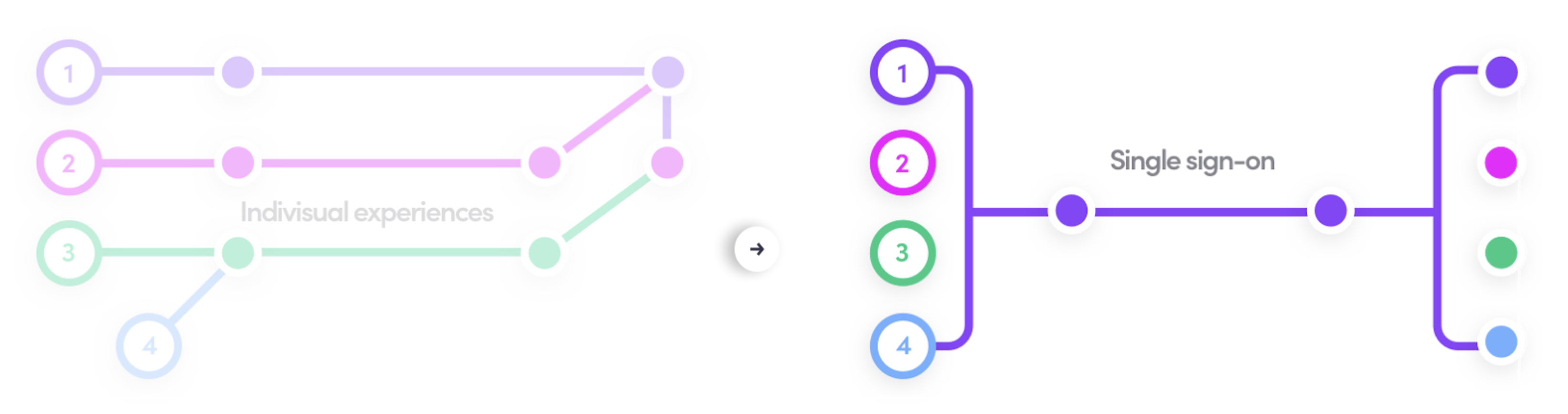
Lyft has multiple business lines focusing on optimizing conversion funnels that are specific to each team. This has resulted in different entry points (teams) building disjoint flows that look and feel different. User across all their stages in life cycle goes through disjoint user experience resulting in confused experience. This results in users creating duplicate account, lower conversion rates and drop off thus lower engagement. There is a separate effort to quantify this and start measuring against different projects lined up.
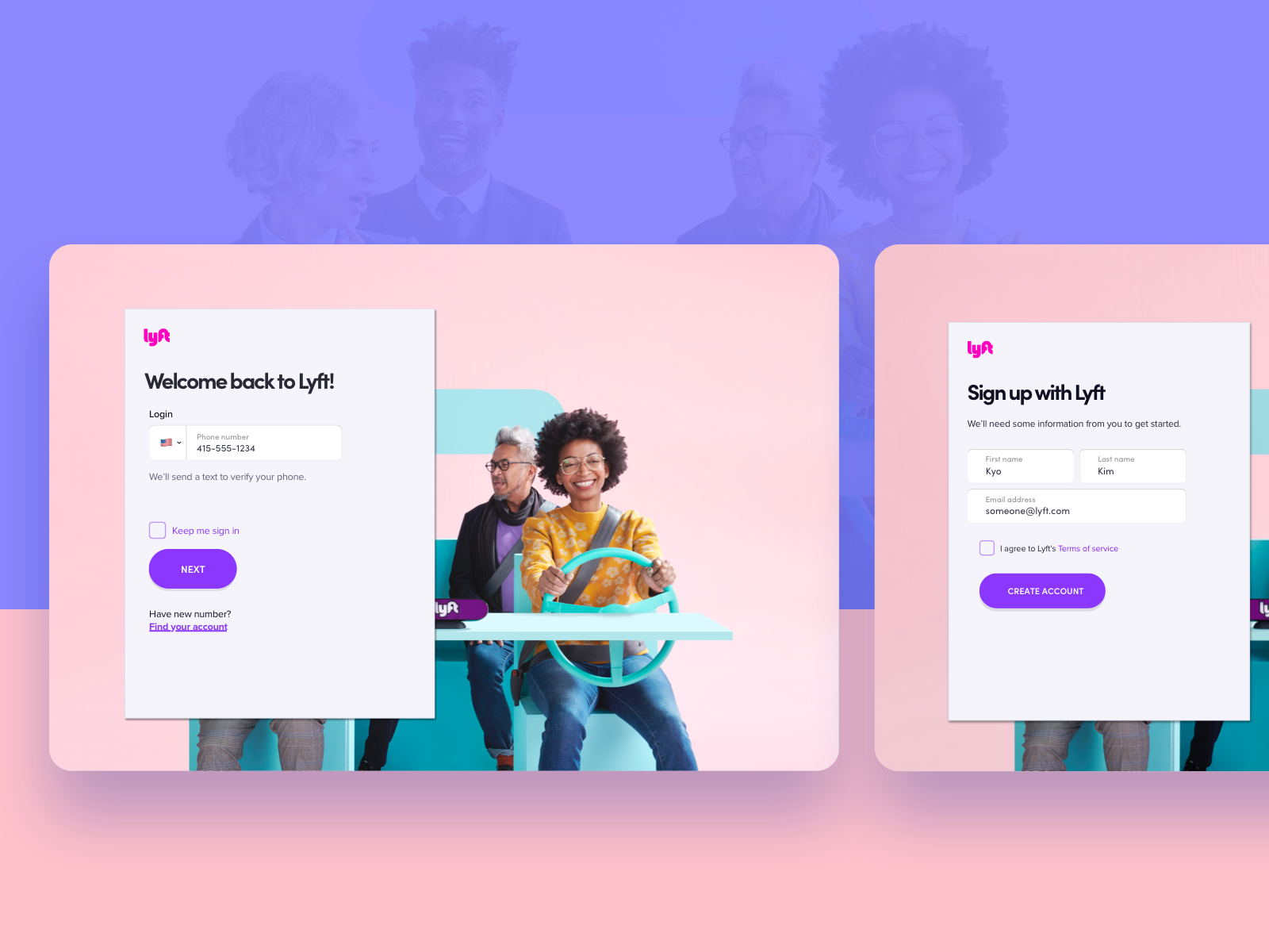
Because of that we had many different sign on experiences on web designed by several teams. Also previous experience was disorganized and inconsistent and it can let users end up creating new account instead of using their existing account. It’s worth a re-think and work-together.
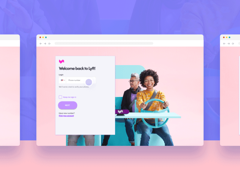
Design refresh is mainly targeted towards making Identity UX have the same design elements (LPL - Lyft Product Language), have similar look and feel to that of rest of Lyft website. All of Lyft website went through design refresh in Q2 2018, hence Identity UX should align with the new design to avoid user confusion and inconsistent user experience. While doing this we will use it as an opportunity to redesign Identity UX, have most of the design elements as part of a customizable template that partner teams can configure to customize the look and feel of Identity Platform UX with that of their product/website experiences. We've rolled out this product in 2018.
Because of the confidential nature of the work, I can't publicly share artifacts from my design process, but I'd be happy to show them to you in person if you'd like.
Feel free to reach out.